CUSTOMER PROFILES · CASE STUDY
Making Every Session Count
Designing an experience beyond reservations, giving members a way to track goals, see their progress, and stay connected to their fitness journey.
- Product
- Project
- Mobile
Problem Statement
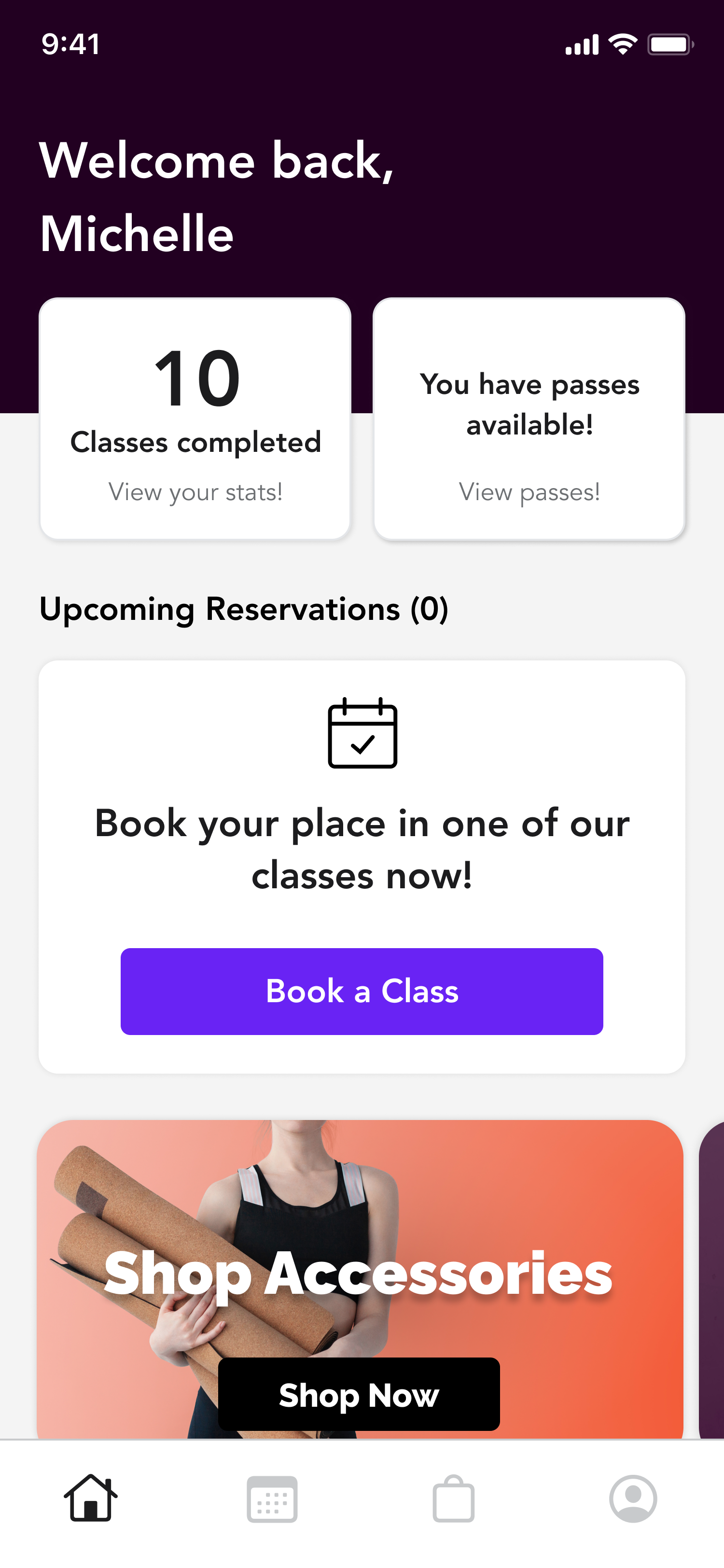
Members primarily use the Mariana Tek consumer app to book or manage a reservation or purchase a product. To track the rest of their fitness journey, they must rely on other apps, limiting ongoing engagement with their studio. In turn, this can contribute to lower retention, lost revenue, and a weaker sense of community for fitness studios.
- Business Problem
- Members primarily use the app for transactional moments
- Customer Problem
- Members have to go elsewhere to track goals, progress, and their broader fitness journey
- Design Challenge
- How might we track the customer fitness journey within Mariana Tek
User Journeys
I started by thinking through several types of members and the different ways they interact with a studio.
 Meet Jessica
Jessica has a membership that allows her to come to yoga twice a week
She likes to take different classes with new instructors so she can find her go to
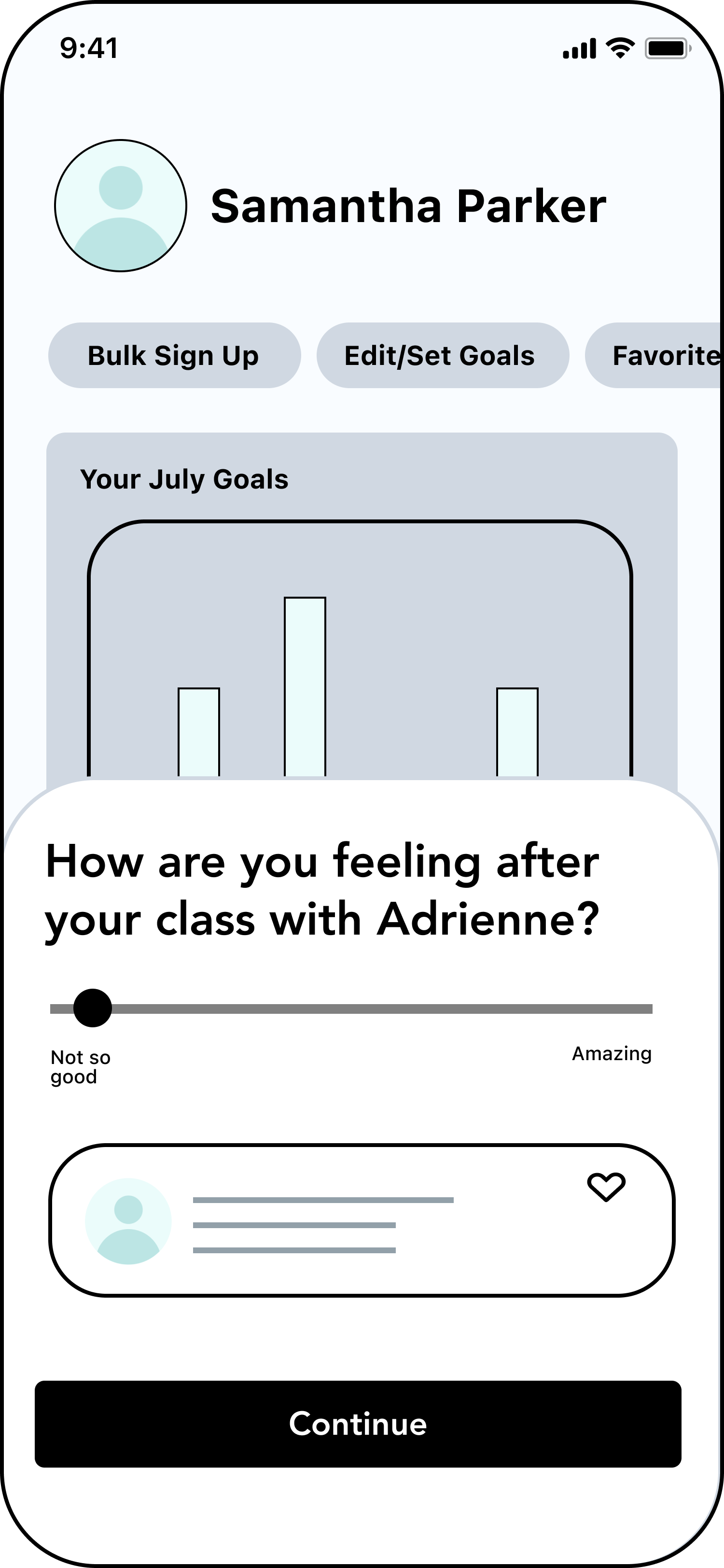
She wants to be able to rate her experience in class so that she can schedule the classes she likes
HMW…
- Help her keep track of classes/instructors she likes
- Help her book multiple classes
- Show her her workout schedule
What Jessica needs…
- Favoriting classes/instructors
- Bulk sign up for classes
- In app calendar or integration with Google calendar
 Meet Josiah
Josiah has an unlimited membership at his yoga studio
He takes 2-4 classes a week and forgets he signed up because he goes at different times and with different instructors
He wants to find a better routine so he can plan out his workouts ahead of time
HMW…
- Help him create a better routine
- Allow bulk sign up for classes
- Suggest classes he has booked in the past
What Josiah needs…
- Reminder notifications
- Goal setting
- Class suggestions, videos of class workout, meet instructor
- Bulk sign up
 Meet Samantha
Samantha has a 20 credit pack at her yoga studio
She takes 1 class a week Hot Yoga with Adrian on Fridays at 4:00
She goes through seasons of taking months off before she buys another credit pack
HMW…
- Help her to remember to buy more credits
- Make it easy and fast to buy more credits
- Show her the progress/milestones she hit so that she has motivation to keep coming back
What Samantha needs…
- Reminder notifications
- Add flexibility and freedom to add/edit payment in app
- Display goals and achievements on home page
Braindump
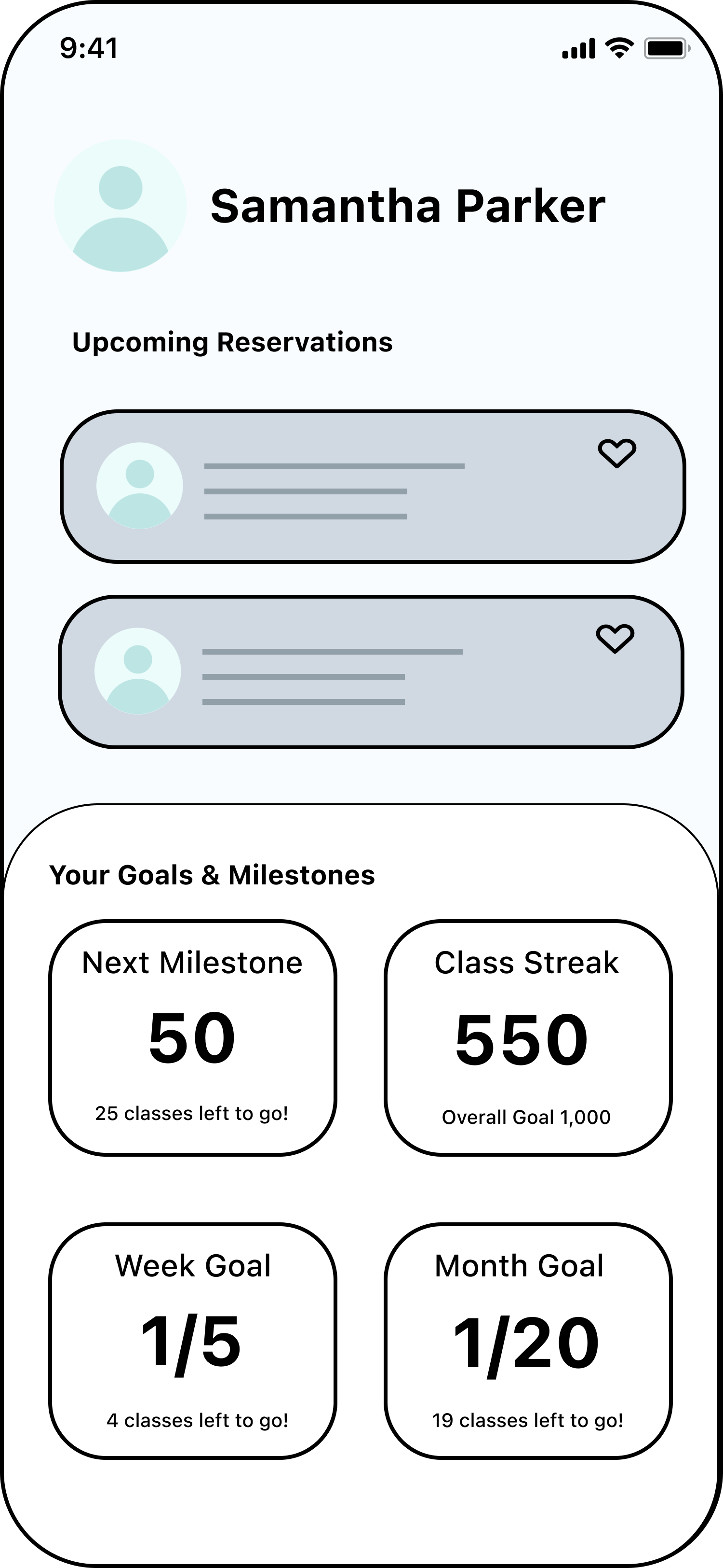
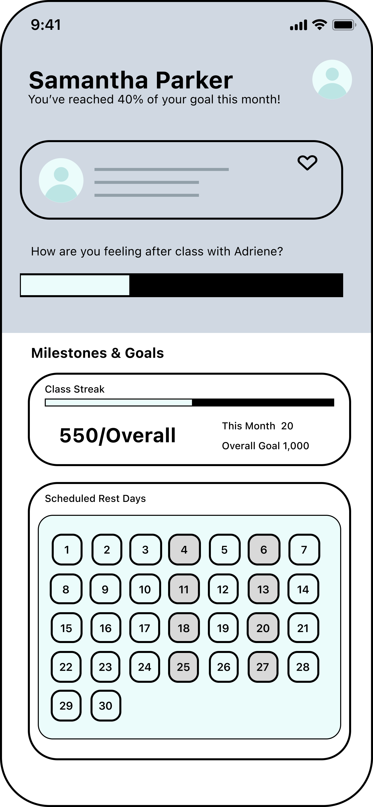
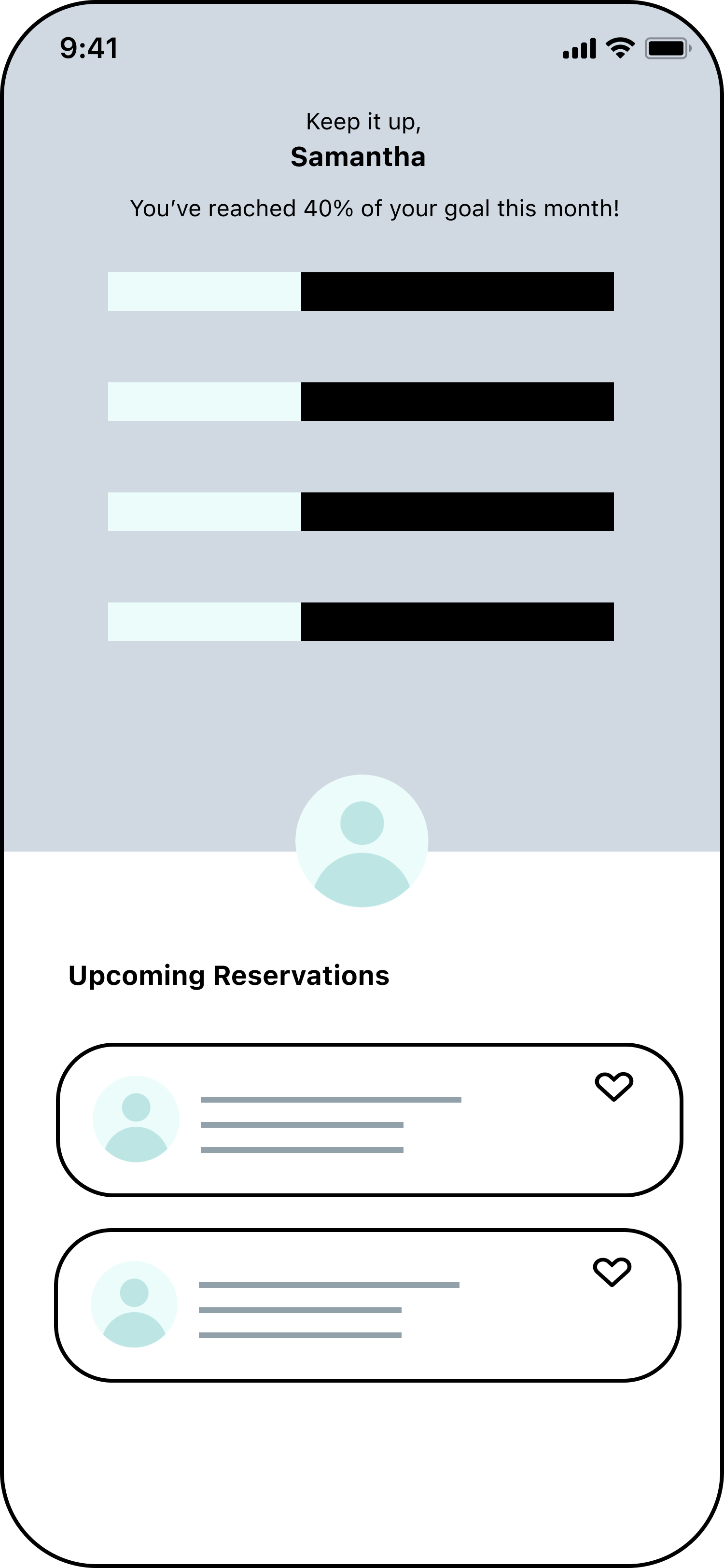
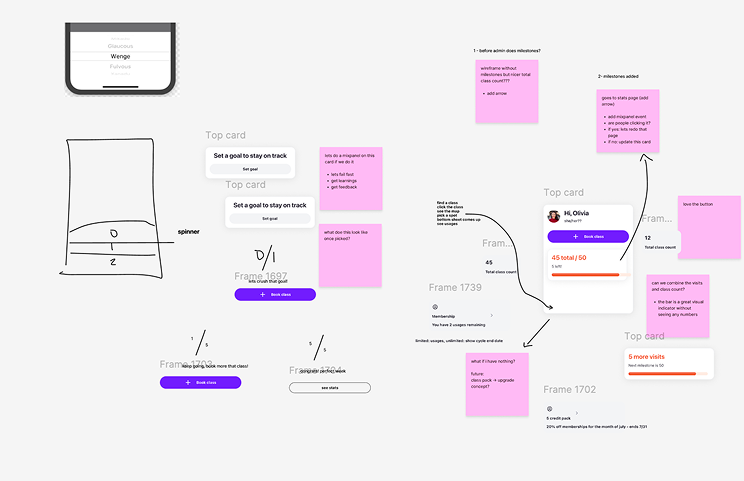
I started by getting ideas out quickly, exploring different ways to bring goals, progress, reservations, and membership into the homepage.
Design Jam & Feedback
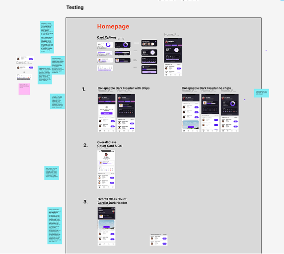
I brought the early concepts to the design team to compare approaches, challenge assumptions, and decide what was worth carrying forward.
Lo-Fi Ideation
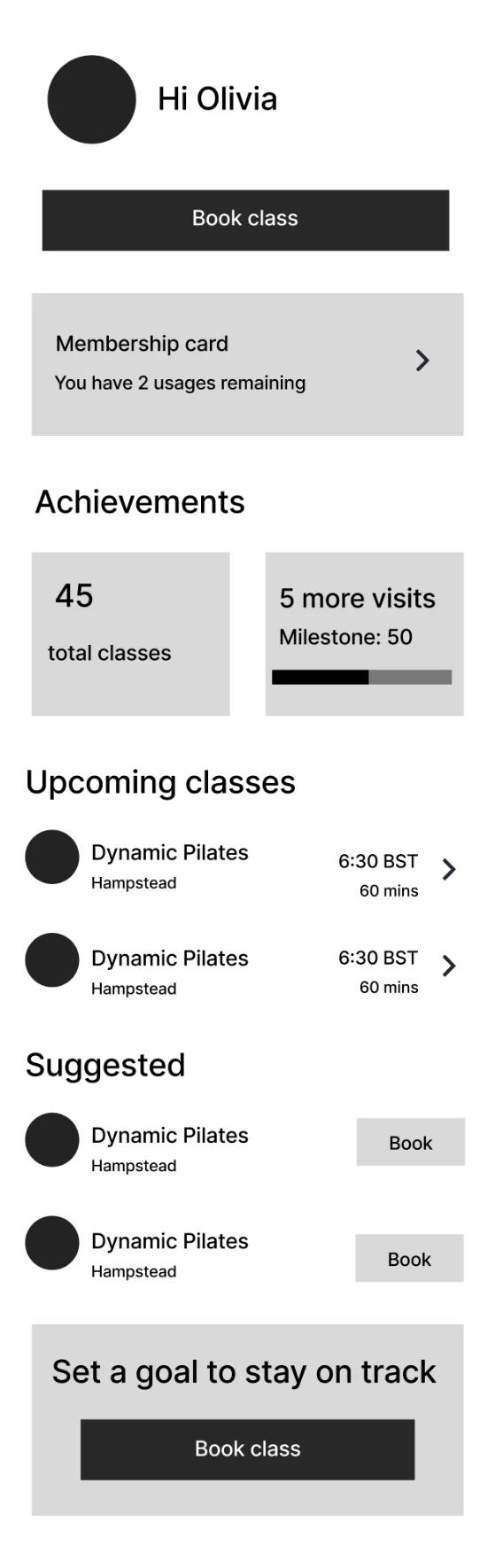
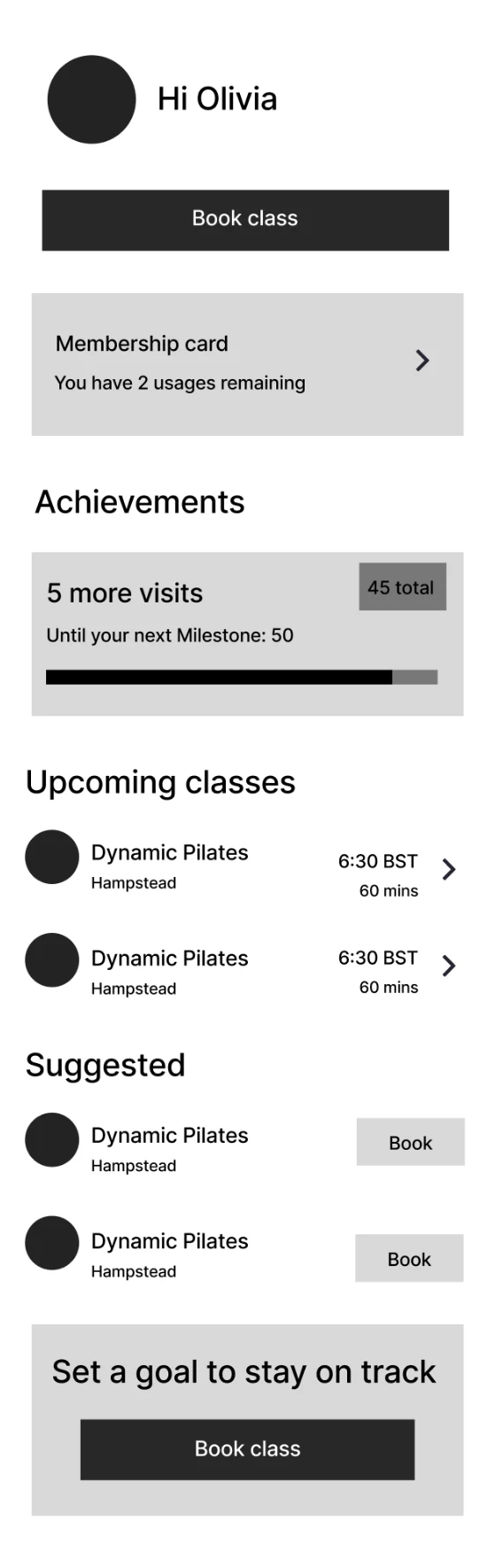
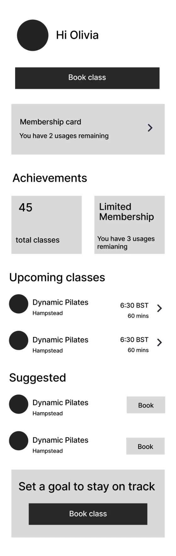
After getting feedback from the design team, I went back to lo-fi ideation to work through the hierarchy and explore how more of the fitness journey could live on the homepage.
- THE KEY QUESTION
- What information would be most useful to members outside of making a reservation, and what deserved priority on the homepage?
- WHAT I EXPLORED
- Different ways to surface progress and milestones while keeping booking, upcoming reservations, and membership information easy to access.
Cursor Sandboxing & Dark Mode
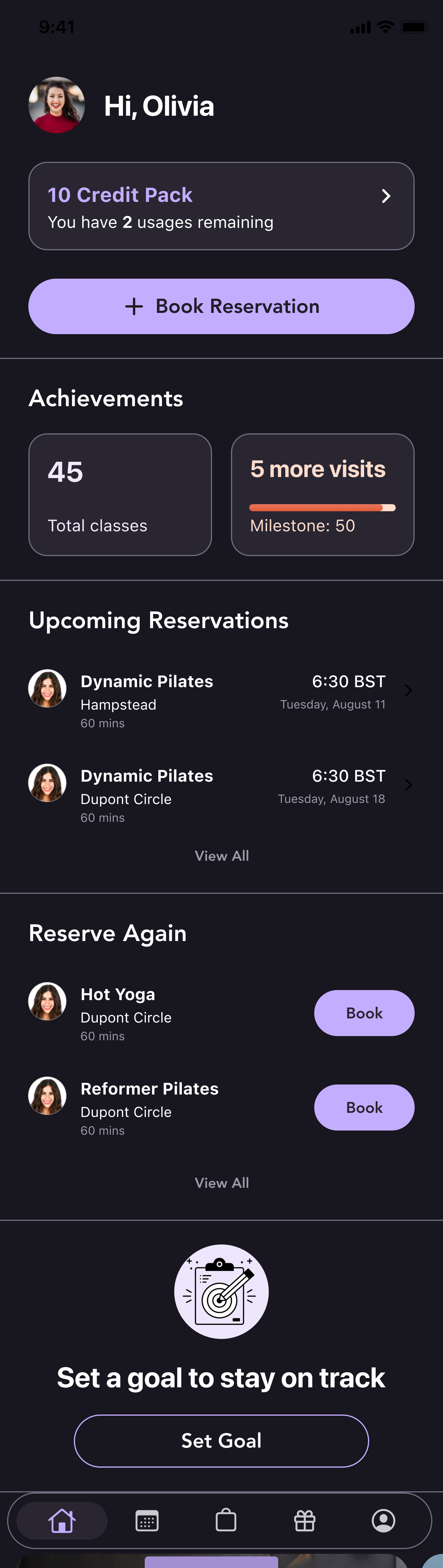
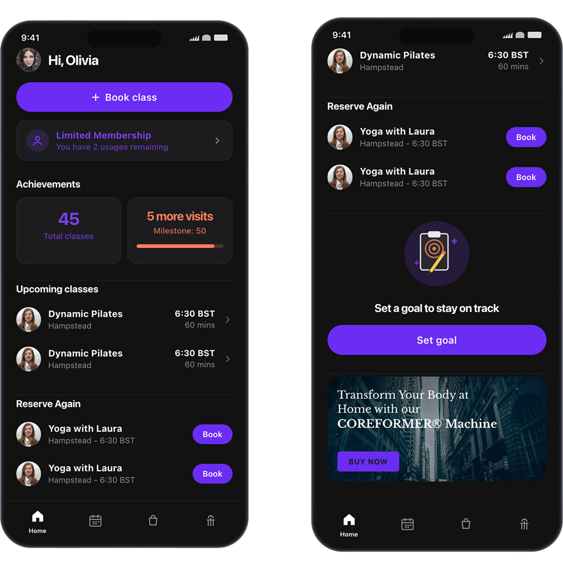
I used Cursor to quickly sandbox ideas in higher fidelity, iterate on components and interactions, and explore how the experience translated into dark mode.
Solution Statement
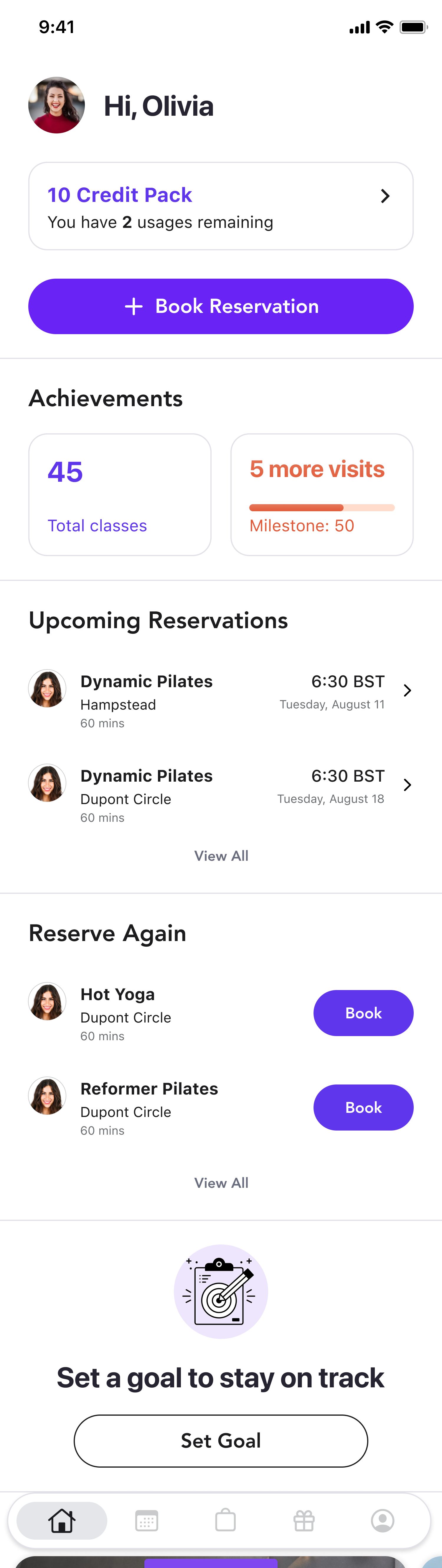
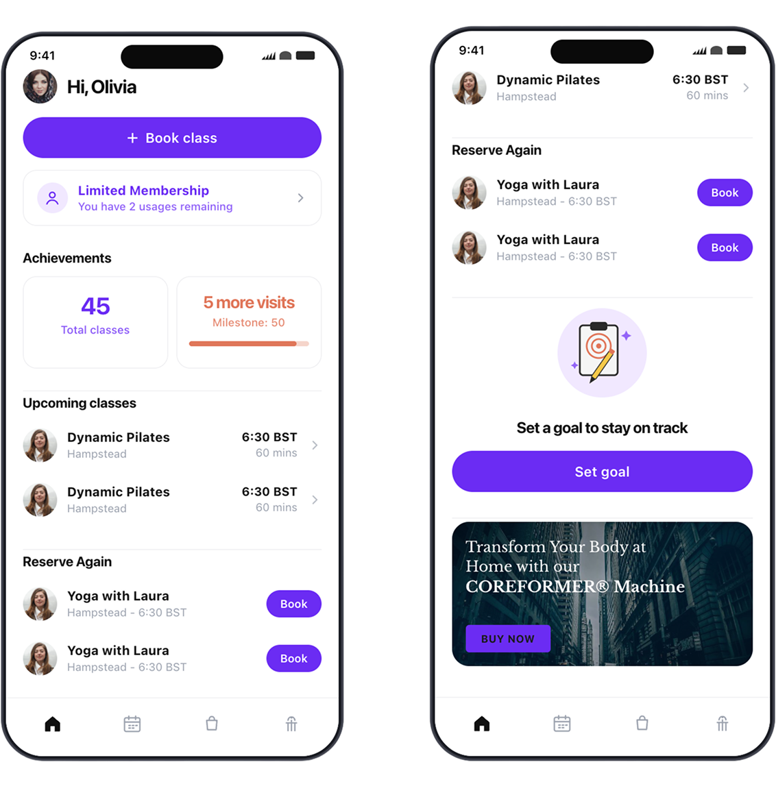
The redesigned homepage brings the fitness journey into Mariana Tek, giving members one place to book reservations, track progress toward goals and milestones, view membership information, and discover what to do next.
- FOR MEMBERS
- A clearer view of their progress, goals, membership, and upcoming reservations.
- FOR STUDIOS
- More opportunities to engage members beyond transactional moments.
- THE SOLUTION
- Turn the homepage into a place members can return to throughout their fitness journey.